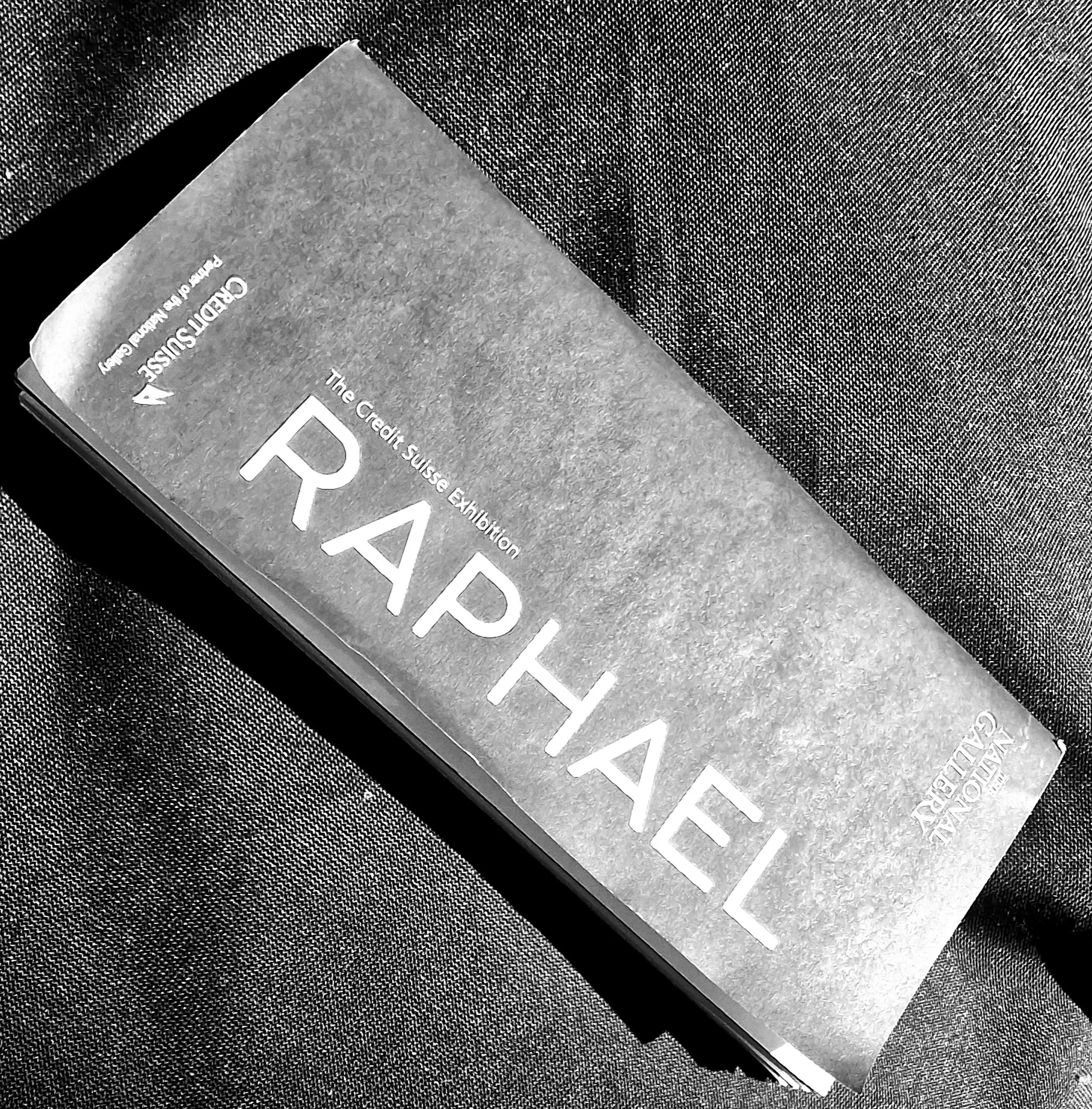
Raphael - Italian Master and Top Turtle
I take a look around my favourite Ninja Turtle's exhibition at the National Gallery.
You'll probably know Raphael from his depiction of two cherubs happily chatting away, usually to be found on the walls of all good Italian trattorias. Despite the popularity of this work, which is actually just the footnote of a much larger painting called Sistine Madonna, there's a lot more to him as I found out at the National's current exhibition.
More than any of the other Italian Renaissance Masters, Raphael was definitely the original user of the 'insta filter'. In comparison to the technical realism created by Leonardo and Michelagelo's depictions of strength and beauty, Raphael's works feature some questionably smooth-faced and chilled out individuals; you won't find a wrinkle amongst them. The subjects of his paintings often radiate a feeling of serenity but he didnt aim for perfection, and often balanced this 'inner calm' with a few hints of every day life; whether that's a stray hair out of place or a nod to normality through the odd gesture, usually as a result of his life long study of live models.
He was also a master of conveying relationships between his subjects. In contrast to other religious artists, Raph (I'll use his turtle name) often represented Madonna simply as a new mum looking after her little one, keeping an eye on him in case he was about to kick-off. It makes the whole scene look much more 'normal' and accessible, and it's a style he used time and again, especially when creating commissions for friends and family, in my opinion the best room of the exhibition.
What you might not have realised when watching 90s kids TV, is that the relationship between the two older turtles, Leo and Raph wasn't actually that far from the truth...you know, aside from being brothers and heroes in half shells and all that.
Both artists worked in Florence around the same time and clearly knew of each other's work. Raphael definitely looked up to Leonardo, even to the extent that he created a series of sketches and paintings which were directly inspired by the composition of the Mona Lisa (google La Muta).
Despite being so ridiculously young when he started to hit the big time and only living to 37, Raphael had the ability to learn quickly from those he admired and push their ideas annoyingly just that little bit further, creating seriously impressive works as a result of it.
The Credit Suisse exhibition is definitely worth a visit, on at the National Gallery until 31 July 2022.
I'll talk about the relationship between Raph, Leo and their mutual nemesis Mikey (Michelagelo) another time, their rivalry would have made a great episode.

Galleries in Lockdown
I’ve had a busy morning; I went to two gallery exhibitions in my pyjamas.
There’s no doubt we’re living in strange and unsettling times. If there’s one small positive we can take from the current crisis, it’s highlighting the importance of the role that creative industries can play in our lives.
In the last few weeks I’ve been to plays I could never get tickets to, exhibitions that are usually crowded and concerts I could only imagine being on the front row of.
My own little exhibition went online this year too: https://www.stneotsmuseum.org.uk/exhibitions/favourite-places/
Here’s the two I ‘walked around’ this morning.
Royal Academy of Arts - Picasso and Paper
https://www.royalacademy.org.uk/exhibition/picasso-and-paper
I didn’t initially buy tickets to see this exhibition but I kind of wish I had now. Picasso painted well into his nineties and so there’s generally a lot of opportunity to see his work throughout the world.
Whilst I love a Picasso exhibition when I see it, the title of this one made me think I probably wouldn’t be missing much. Today’s online tour of the exhibition definitely made me think otherwise.
At one point it explained that Picasso is ‘endlessly resourceful’ and this really comes across. The exhibition shows Picasso’s love of creating art out of pretty much anything and everything, from hotel letterheaded paper, to wallpaper samples. Cut-outs and collages helped to shaped some of Picasso’s most famous works, from Guernica to Weeping Woman.
One of the most interesting parts about this exhibition is how most of the work on display has even survived! Some are just frail scraps of ripped paper, others are massive cardboard costumes. I’ve no idea how they’ve been preserved but I’m glad they did.
Tate Modern - Andy Warhol
https://www.tate.org.uk/whats-on/tate-modern/exhibition/andy-warhol/exhibition-guide
The exhibition is a biography of Warhol’s life, showing his transition from commercial illustrator to the creator of some of the most iconic images in recent history. In particular, the exhibition focusses on sexuality and Warhol’s experiences living as a gay man during a time of significant cultural change.
There are some important works on display, including images from Silver Clouds, marking his transition from artist to filmmaker.
Overall, I came away with a better understanding of who Andy Warhola was (he dropped the ‘a’ when he moved to New York) and a much better awareness of who and what inspired him before he became a modern-day icon.
I don’t think anyone is saying an online exhibition will ever replace getting up close and personal to actual works of art, but I still came away from both feeling I understood more about the artists and their works. Let’s hope they are still running once we’re able to leave the house!
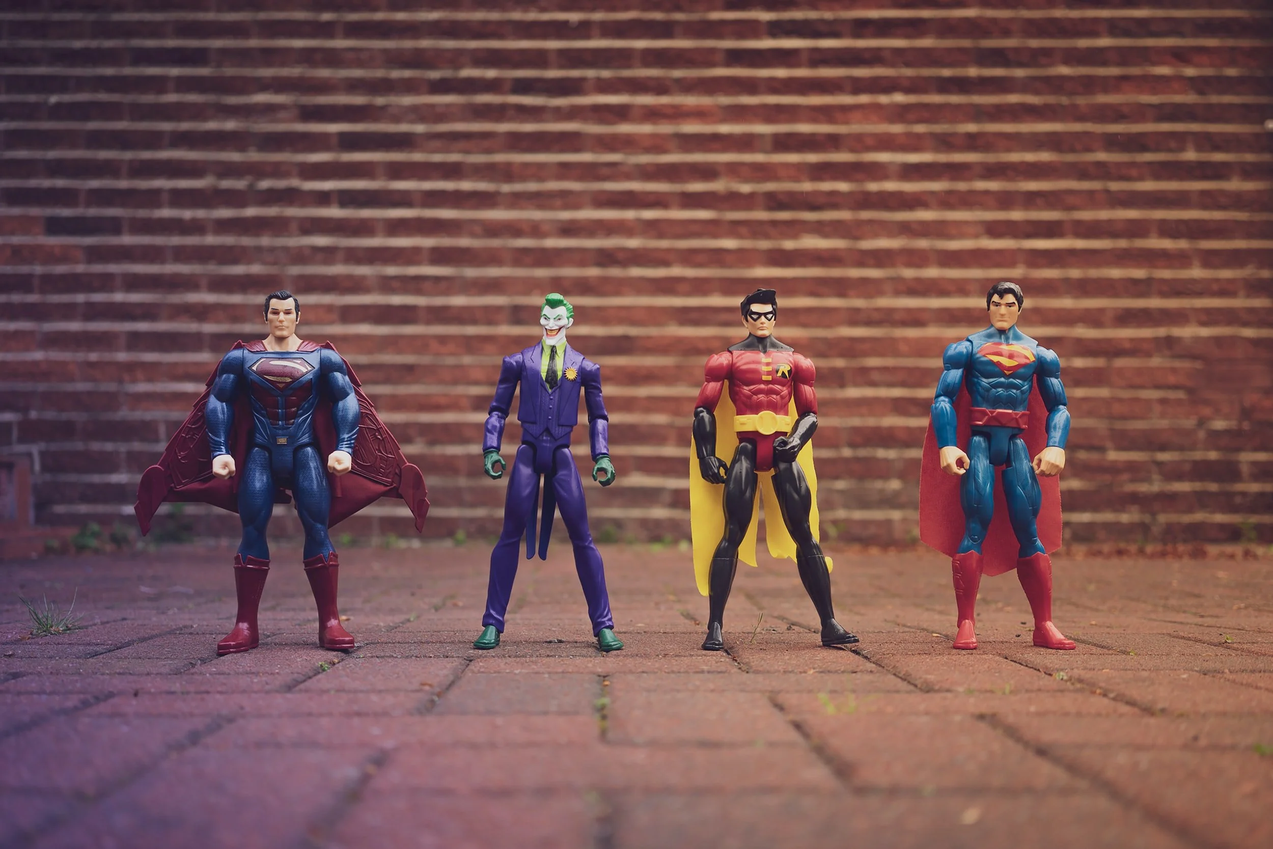
William Blake – The King of the Power Stance
William Blake - visionary, creative and painter of teeny masterpieces!
William Blake – The King of the Power Stance
I’ll admit that I didn’t know a lot about William Blake before going along to this year’s Tate Britain exhibition. I remember someone in my school art class really loved his work, but that was pretty much it.
A few things in particular really interested at the exhibition:
The Power Stance
When you look at a William Blake painting, I think it’s fair to say they are pretty dramatic; there’s not one subject that’s just standing around looking vacant- if they weren’t doing a Ted Talk worthy power stance, then they probably wouldn’t have made it onto the canvas.
The Subject Matter
Blake was clearly very spiritual, and not just in the religious sense, although a lot of religious subject matter definitely features. The exhibition doesn’t try and analyse his paintings, which is quite refreshing as it leaves you to reach your own conclusions; something people have been doing with Blake’s works for decades.
The Size of Them (spoiler alert, they’re tiny!)
Now I’m a big fan of a massive canvas, and I would have thought if anyone shared this love it would be William Blake, who tackles some pretty epic subject matter. But walking through the exhibition you realise he’s painted these powerful iconic images - but on a teeny scale! It’s impressive that they still manage to make the impact that they can whilst being so small.
I learnt that Blake always dreamt of painting some massive frescos of his religious art, and it was such a shame that he never did as they would have been incredible. At one part of the exhibition they even superimpose one of his works onto the back of an altar piece, to see how it would have looked in large scale, I think he really missed a trick.
Overall, I came away with a better grasp on the man who claimed to have visions, who some saw as a genius and whose creativity continues to inspire language and painting to this day.

Portraiture – Where I get on my high horse about Gauguin
Why Gauguin annoys me and Freud is like Where’s Wally
As you’ll see from my website, portraits are not something I often have a stab at. I admire them but struggle to get the same freedom and creativity that you can from a landscape.
So to learn more about portraits I went along to two major exhibitions; Lucian Freud The Self Portraits at the Royal Academy, and Gauguin Portraits at the National Gallery.
Here’s what I thought:
Freud’s self portraits
Freud is a bit like the ‘Where’s Wally’ of portraiture. If he’s not the subject of the painting, then he still likes to make sure he kind of is. Whether it’s a shadow of his head on a bed, or looking back through the window behind the sitter, you can pretty much always see Freud somewhere on the canvas, it becomes a bit of a game to spot him, so your attention is always diverted from the main subject.
There’s no doubt he probably had a bit of an advantage in the art word, after all he comes from a pretty recognisable lineage. Freud’s mum helped him to get one of his paintings in the London Guggenheim Jeune Gallery when he was a kid. Not a bad start really.
I found I quite enjoyed learning about Freud’s style, which has definitely changed a lot since he was a teenager, from the sharp jawline and wide-eyed sketches, to pallets of flesh tones and a thick application of paint - definitely more my style. Its worth a trip to the exhibition if you can get there before it closes in January.
Gauguin’s Portraits
I know you don’t have to like an artist to really love their work, but Gauguin kind of annoys me, really annoys me actually. He’s like that friend that never stops banging on about his gap year and boring everyone with details of how fascinating it was.
To me, Gauguin always seemed to be in search of an authentic and untouched part of the world (but only the places in which everyone could conveniently speak French).
He loved Tahiti and painted some of his most recognisable works there, going back several times later on in life. Aside from some the dodgy stuff he got up to when he was out there, I think the thing that frustrates me is that for someone in constant search of authenticity, he was always trying to recreate what he wanted to see, not what was actually happening. Gauguin frequently asked people to dress in traditional robes (or none at all), rather than in their everyday clothes, and he painted rituals he’d made up when he thought the ones he saw were a bit boring.
So two very different exhibitions, two very different styles. Both are on until 26 January and you can easily visit them in the same evening.


How to Look at a Painting – Lighting
I take a look at Delaroche’s Execution of Lady Jane Grey as a great example of the use of lighting to tell a story
Google The Execution of Lady Jane Grey by Delaroche
When lighting works, it can add a totally different dimension to the story that an artist is trying to tell. One of the best examples of this is The Execution of Lady Jane Grey.
For me, The Execution of Lady Jane Grey is one painting I can’t help but stop and stare at when I visit the National Gallery in London (and I’m not the only one, apparently, it’s the most polished part of the floor in the entire gallery).
Despite the many mixed reviews the painting received from critics, it manages to be beautiful and romantic whilst also being massively uncomfortable and unjust to look at.
You’ve got Lady Jane Grey in the foreground on the morning of her execution (clue’s in the name I guess) eyes covered so you can see her trying to just feel her way onto the executioner’s block. The executioner himself is looking on from the side as if he’s got something better to do, and everyone else is crying around her. It’s already a scene of mixed emotions, but it’s the lighting that really makes it.
In an odd way (and bear with me on this one) it’s a bit like the opening credits of Mr Bean, where the spotlight is placed directly above the subject (yep, I did say bear with me). The affect of this lighting gives Lady Jane Grey an almost celestial look; highlighted by the white dress and white blindfold. I seem to remember the opening credits to Mr Bean had some angelic music to accompany it, which wouldn’t be out of place with this painting either.
Delaroche took key moments from history and sprinkled a bit of artistic licence on them to deliver the emotional response he was looking for, but whatever you think of the subject matter, he was a true genius when it came to manipulating light and shade for dramatic impact.

How to Look at a Painting - Composition
Google ‘Edvard Munch The Scream’
Until recently I was in the “a 5 year-old could do that” camp on Munch. That was, until I went to the British Museum’s Love and Angst exhibition and saw his work in a totally new light.
The Scream is a great example of composition, it’s like a game of snakes and ladders. Every line or curve on the canvas, from the diagonal of the promenade to the swirling clouds takes you straight back to the skull-like image, covering his ears from the screaming sky (a common misconception is that he is the one screaming; he’s actually distanced himself from his group on the pier to try and avoid an anxiety attack).
It’s an incredible composition. Wherever you look your eyes keep getting guided back to the focal point of the painting. It’s like Munch is saying “nope don’t look there, back you go, have a look again at that man having the worst time of his life.”
Composition is a useful thing to look for in any painting. Your eyes will naturally go on a journey across the canvas, with markers of lines, shapes and objects that the artist has structured to get you to focus on where they want your attention.
The Scream was part of a group of works Munch called “The Frieze of Life”. They were some of his most evocative works, but he wasn’t precious about his art, famously saying “it does them good to fend for themselves” when they were damaged or rained on.
Munch knew each and every aspect of The Scream by heart; each element, from the mummified expression on the man, to the promenade, to the sky and the people in the background. Every detail had already featured in other works, or had come from inspirations in his earlier life. He chose The Scream to bring them all together. The simplicity of the painting (pastels or woodcut- there are several versions) helps to keep the message concise; it’s scratchy, dark and there’s not a trace of glamour or romance.
I’d like to see a 5-year old try that.
Book Review: The Art of Creative Thinking; Rod Judkins (Hodder & Stoughton Sept 2015)
Love art but also have a day job? this is the book for you.
The Art of Creative Thinking; the perfect book for creatives that also happen to have a day job.

For me, this is the perfect business book. It’s an opportunity to learn hints and tips about how to develop a creative mindset and apply it in any context. The examples given are from the stories of well-known artists, all told by an expert in creativity, business and art; Rod Judkins, Lecturer at Central St Martins College of Art.
Here’s a few of the things I found out:
Dali designed the Chupa Chup wrapper (yep, he actually did)
Artists usually don’t just paint, they dabble in a lot of creative activities, they can’t help it
Healthy rivalry is as important in the art world as it is in business (thinking Steve Jobs and Bill Gates, think Turner and Constable)
There are very few new ideas- everyone takes inspiration from the ideas that went before (according to the author, Harry Potter isn’t so far off Star Wars) but if you’re inspired by something, probably best to just create it and get it out of your head
Sometimes you need to break stuff, imperfection is much more interesting
The Art of Creativity is a helpful reminder of what it takes to learn from others and never to strive for perfection. Unless you’re designing a lollypop wrapper that is.
How to Look at a Painting- Introduction
Aside from actually painting, a solo visit to a gallery is probably one my favourite pastimes. I’m pretty sure I even have a special ‘museum walk’ (no idea why).
I’ve been lucky enough to go to a lot of the world’s best galleries. Closer to home I tend to visit the London galleries after work. Most run late nights one Friday a month, when they stay open until about 10pm. For me, these are the best times to visit as you’ll pretty much get the place to yourself once it gets to 8pm, and you can get up close and personal to the paintings (well, as far as the serious looking security guard sat in the corner will allow you to).

Everyone looks for different things in a painting; for some it’s whether they like it (a pretty valid reason in my opinion) through to the more technical aspects of the painting. Whilst I can’t profess to being an expert (there are a lot of people who are and have also written on this subject) I can tell you a bit about some of the things an artist or art lover might be looking at when they visit a gallery.
PS it’s pretty tricky getting permission to show famous masterpieces on my little site, so just google it alongside the blog and you’ll see what I’m talking about!
Topics I’ll cover in future posts include:
Composition
Technique
Messaging
Lighting
Context
If you’re interested in reading more, see my blog How to Look at a Painting - Composition.
That Time I Almost Rented Van Gogh's Place
I took a look around the Van Gogh in Britain exhibition at Tate Britain
Vincent Van Gogh is an artist I’ve always felt like I ‘get’, maybe not from a personal life point of view (my ears are firmly in tact), but definitely his approach to painting.
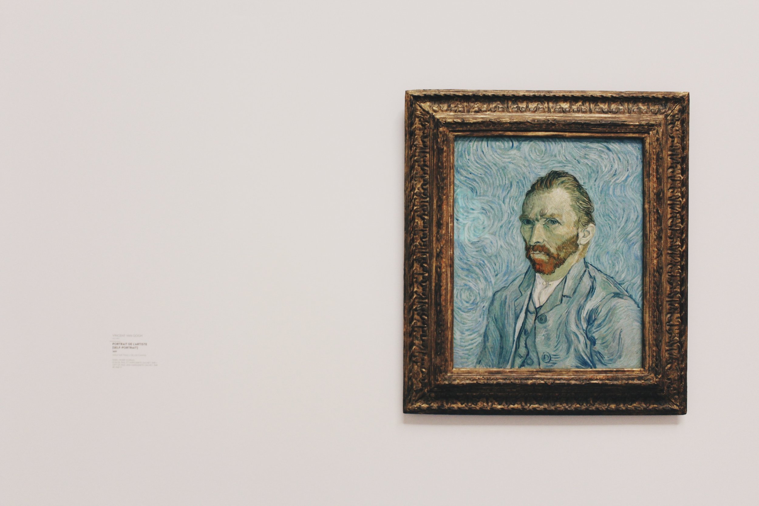
The dude himself
Van Gogh is an artist’s artist; he’s someone that struggling painters frequently refer to when they’re having difficulty shifting their own works (Van Gogh famously only sold one in his life time).
When we first looked at flats in London I was very tempted to go for one particular one in Oval, because Van Gogh had lived there during his early years in London. It had a nice blue plaque, even if it didn’t have many windows.
It was a surprise to see same block of flats was actually a feature of the recent Van Gogh in Britain exhibition at the Tate.
The exhibition focused on his time in London, when he was trying his hand at being an art dealer (he moved onto painting when selling other people’s art didn’t quite work out, mind you it turns out painting them didn’t either). During this time in England, he took inspiration from writings that would later influence his work (the grim world of Charles Dicken’s a particular favourite). Whilst some of the connections between Britain and the works in the exhibition did at times feel a bit too coincidental, it’s still a good collection. Highlights including Starry Night and one of his infamous sunflower studies (the main selfie opportunity for most).
In terms of technique, I love that Vincent can’t help but put a thick dark line around almost everything he paints, I get that too- it never seems finished otherwise. He painted what he wanted to paint, even if he got a lot of stick for it at the time. To really appreciate his technique you need to see his original works, prints don’t do the colours justice (and he chose them well, apparently he only ever used six base colours).
Van Gogh may not have stayed in Britain for long, but the time he was here made a lasting impact. I just wish the Clapham flat we eventually went for could have boasted such an infamous tenant.
Love art but also have a day job? this is the book for you.